
I think these designs are looking amazing! One minor bit of feedback is that the different colored fonts on the obverse read like they should be grouped and read together, rather than following down the column. Took me a second to parse them. Maybe that's just because I'm looking at it on a screen, though?
- Welcome to Wittenberg.
This section allows you to view all posts made by this member. Note that you can only see posts made in areas you currently have access to.
#1832
Coletx d'Armeux Rexhital/The College of Arms / Re: Badges
March 25, 2022, 03:38:40 PMQuote from: Dr. Txec Róibeard dal Nordselvă, Esq., O.SPM, SMM on March 25, 2022, 02:58:17 PMI believe that is your arms, just on a round escutcheon, right? For a badge, you could adopt a scroll or basically any other device you wanted on a background of white and red divided probably in the same way as your arms, but maybe completely differently.
It seems that in the UK, for example, badges are granted by their College of Arms, normally when granting new arms, and included in their Letters Patent. I would think that if we're to begin using these ourselves, it should be regulated by the RTCoA and based on either new grants of arms or if requested, upon previously granted arms.
Here is an example of my own Arms in badge form.
-REH
It does look like a UK started regulating badges and treating them as something you can request when you request arms, but I was charmed at the idea that there could be a device that people could adopt whenever they wanted or even change, and that would be appropriate to have on livery or members of the household. That's why I brought it up... if we treated them differently then arms, then It might be a fun new thing for people to mess with. If there's one thing I've learned from observing heraldry for so many years with an avid interest, it's that people really like discussing symbolism about themselves and their interests, so giving people more chances to mess around with that seems like it would be a good thing. And if it was free from the usual constraints of the college and the king, it would give people a chance to experiment with different ideas. My daughters made me think of this... I love chess and love the trappings of nonsense feudalism and clever tactics, and so I was thinking of that when designing my arms all those years ago. And that's great for my house in perpetuity! But I want them to have the chance to express themselves in a similar way, and badges will be a means for that.
I'm not married to the idea either way, but it's just something I was thinking about and thought I would throw out there to start a discussion.
-NRH
#1833
Maritiimi-Maxhestic / Re: Hello new, potential neighbors
March 25, 2022, 02:22:45 PM
Let me first offer my congratulations at your good fortune. Our province is widely acknowledged throughout the province as the best province.
#1834
Coletx d'Armeux Rexhital/The College of Arms / Re: Badges
March 24, 2022, 10:45:14 PMQuote from: Danihel Txechescu on March 24, 2022, 10:18:28 PM
Please pardon me if I interrupt...
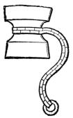
I have created (and used) this medallion directly from my arms:
Here it is on a case:
And I even got myself an embosser! Here's a sample on a soft tissue (hehe):


This is really cool! It's your arms on a circular escutcheon. Where did you get the embosser? Looks like it works really well.
-NRH
#1835
Coletx d'Armeux Rexhital/The College of Arms / Re: Badges
March 24, 2022, 07:40:44 PM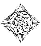

#1836
Wittenberg / Re: Talossa National Lottery
March 24, 2022, 07:27:17 PM
Wow, look at this tycoon get to work! Two staffers already, the most for a private enterprise in years! Love it!
#1837
Coletx d'Armeux Rexhital/The College of Arms / Badges
March 24, 2022, 07:25:55 PM
I was thinking about the heraldric tradition of badges recently.
Fox-Davies illustrates his discussion of the badge by providing the badges of the Earl of Stafford, who had eighteen badges in his house in some capacity (unknown precisely, although perhaps for eighteen members of his extended family?), Edward the Black Prince, who used his badge of an ostrich feather piercing parchment on more occasions than his formal arms, and the rival houses of the War of the Roses which were both members of the Plantagenets (Gules, three lions passant guardant Or) but were identified by their badges (among other examples).
The whole thing has me thinking about how badges should be used in Talossa. I believe that we should treat them the same way they were treated in England: unregulated, ungranted, and borne by individuals rather than by families. So while my daughters would bear my family arms, they could each adopt their own badges.
Thoughts from the College?
-NRH
Quote from: Arthur Fox-Davies' A Complete Guide to HeraldryThere was never any fixed form for the badge; there was never any fixed manner of usage. I can find no fixed laws of inheritance, no common method of assumption. In fact the use of a badge, in the days when everybody who was anybody possessed arms, was quite subsidiary to the arms, and very much akin to the manner in which nowadays monograms are made use of. ... [The badge] was worn by the servants and retainers, and was used right and left on the belongings of the owner as a sign of his ownership. So great and extensive at one period was the use of these badges, that they were far more generally employed than either arms or crest
Fox-Davies illustrates his discussion of the badge by providing the badges of the Earl of Stafford, who had eighteen badges in his house in some capacity (unknown precisely, although perhaps for eighteen members of his extended family?), Edward the Black Prince, who used his badge of an ostrich feather piercing parchment on more occasions than his formal arms, and the rival houses of the War of the Roses which were both members of the Plantagenets (Gules, three lions passant guardant Or) but were identified by their badges (among other examples).
The whole thing has me thinking about how badges should be used in Talossa. I believe that we should treat them the same way they were treated in England: unregulated, ungranted, and borne by individuals rather than by families. So while my daughters would bear my family arms, they could each adopt their own badges.
Thoughts from the College?
-NRH
#1838
Wittenberg / Re: SENESCHÁL 2022: Debate me, Brenéir!
March 24, 2022, 04:57:56 PMQuote from: Miestră Schivă, UrN on March 24, 2022, 04:14:35 PMIt is true that I'm a booster for the country, no matter who's in charge. I'm always going to root for Talossa and urge people to join and do fun things, because I love it and I believe in it.
I mean, I heartily agree with this statement:Quote from: Baron Alexandreu Davinescu on March 23, 2022, 09:17:10 PM
The new Talossan Renaissance keeps on building up steam!
But it totally flies in the face of this statement:Quote from: TNC campaign email
something needs to change. We can't afford another two years of this grim slog.
I suppose the truly shameless and dishonest would suggest "oh, all these people are coming back into action because they're being galvanised by the TNC election campaign! And they'll go away again if we're not elected!"
But it's kind of silly to pretend that suddenly everything is okay, or suddenly decide you guys actually did a good job.
Activity always picks up at election time. It's been an ironclad rule of Talossa for decades: when it's time to vote, people remember to come visit and chat and do stuff. It's great to see people like Antaglha and Afacat back here and active -- I'm glad to see them and glad when they get busy at doing Talossa. But they've been gone since basically just during the last election. There's nothing wrong with that, but it's part of a larger pattern in the country.
I mean, it was just last election when we went through this same thing, remember? After a very quiet term and when immigration was at a dead stop, you decided that actually activity levels were very high and we didn't have any problems. You said I was "gaslighting" about the problem.
Quote from: Miestră Schivă, UrN on May 23, 2021, 08:27:41 PM
Our activity levels that are higher than at any time since the Free Democrats have been leading government, as shown by the huge turnout of parties in the election?
I thought you'd stopped this gaslighting about how Talossa sucks these days and no-one comes here any more
But of course, you were singing a different tune right before the campaign, when you were talking about "a crisis of activity."
And not long after the campaign, when you admitted that "the Government we lead has dropped the ball. Seriously, and collectively. We have failed to actively pursue most of our programme. The country is now in a serious crisis of activity, and it is possible that Talossa will die within 6 months if something doesn't change."
The only thing that seems to change your perception of a crisis of activity is... well, your re-election campaigns! Just as soon as you're running for re-election, you suddenly realize our problems have all been solved and the country should be grateful.
But people are getting active again because it's election time and some folks are pouring their energy into trying to do things and encourage others. It is just plain foolish to waste opportunities like this, when the tide rises and we can furl our sails. If we return to another term of do-nothing and broken promises, then we risk losing our chance to set sail for better waters. And who knows how many more chances we'll get? Someday, if we don't change things, the tide may not be able to lift us off the rocks.
By the way, and I know this is just an oversight, but you completely forgot to get into any of that red-and-green tape that tied your party's hands this past term.
#1839
La Società Rexhital per l'Avançamaintsch del Säp/The Royal Society for the Advancement of Knowledge / Re: An Introduction and Membership Questions
March 24, 2022, 10:52:11 AM
Maybe if you immigrate, you'll be the one to get it rolling again!
#1840
Wittenberg / Re: What Counts as Culture?
March 24, 2022, 09:12:15 AM
There's no real answer to that question, just as there's no answer to what constitutes French culture or American culture. Generally speaking, things that take place mostly in Talossan spaces, between Talossans, or which are about some aspect of Talossa have been considered Talossan culture. Some people like @Iason Taiwos or @xpb have even developed subcultures with their friends in Talossa (Cjovani and distinctly Cezembrean, respectively).
#1841
La Società Rexhital per l'Avançamaintsch del Säp/The Royal Society for the Advancement of Knowledge / Re: An Introduction and Membership Questions
March 24, 2022, 08:55:47 AM
"Requirements for Associate Membership:
1. Be a citizen of Talossa.
2. Write an essay of not less than three paragraphs but not more than ten paragraphs outlining an active, scholarly interest you have and how you can advance that scholarly interest as an associate member of the Royal Society.
Requirements for Fellow of the Royal Society:
1. A Royal Fellow will have met all of the requirements for associate membership.
2. A Royal Fellow will possess at a minimum the equivalency of a High School Diploma
3. A Royal Fellow must declare upon application a scholarly interest and to maintain membership at this level will present at least one lecture annually on that topic.
Requirements for Senior Fellow of the Royal Society:
1. A Senior Fellow will have met all of the requirements for Fellow of the Royal Society.
2. A Senior Fellow will possess at a minimum the equivalency of a two-year Degree from a college, university, or technical school.
3. A Senior Fellow will present at minimum one lecture per year and participate in the annual Royal Society Symposium either as a lecturer or presenter."
The Society used to be the University and it was pretty different, some years ago. When it was referred to as the University, people would offer lecture series and full courses devoted to things that interested them. The old message board shows a bit of how it used to be: https://talossa.proboards.com/board/30/royal-society-advancement-knowledge I actually taught two classes when that was a thing: one on wiki-markup and another on the writer Ernest Hemingway.
I suppose that, technically speaking, there are no existing fellows or senior fellows. The only one who has ever offered a lecture is @Ian Plätschisch , I think, and that was a few years ago. And there's never been a symposium, ever. I'm not sure who's in charge, but nothing's been done with the place basically since they eliminated the University and replaced it with the Society. It'd be great if a scholar took charge and started keeping track of things. If it were me, I'd put @Ian Plätschisch , @Magniloqueu Épiqeu Ac'hlerglünä da Lhiun , and @Ián Tamorán S.H. as sitting senior fellows, since they're people who I know have presented us actual new work in a scholarly way, and reboot the whole thing otherwise with everyone else who'd been involved demoted to associates until they did something.
#1842
Coletx d'Armeux Rexhital/The College of Arms / Re: Application for a Coat of Arms
March 24, 2022, 07:58:42 AM
After consulting with the applicant, we've worked out a fairly simple design. Purpure, a dragon sejant affronty upon a spoked wheel all Argent.

#1843
Coletx d'Armeux Rexhital/The College of Arms / Re: A Request for an Armorial Achievement
March 24, 2022, 07:48:18 AM
Dean says that the advancement is fine and I should "do the needful," I think, so I will.
As proxy for the Dean, @Mic'haglh Autófil is hereby proclaimed to be the Long Fellow of the College of Arms.
-NRH
As proxy for the Dean, @Mic'haglh Autófil is hereby proclaimed to be the Long Fellow of the College of Arms.
-NRH
#1844
Wittenberg / Re: GV gives AD a piece of his mind.
March 23, 2022, 09:14:12 PMQuote from: GV on March 23, 2022, 09:04:52 PM
As Minister of Defence, once I was informed - by you no less - the Zuaves genuinely didn't need much help at all from Defence, I let it go at that and didn't worry over it any more.
My goodness! I told you that there wasn't anything you should do? I really thought I gave you some specific suggestions, offered to help you further, and linked you to the available resources. In fact, I'm fairly certain of that. In fact, here's the quote.
Quote from: Baron Alexandreu Davinescu on August 21, 2021, 10:27:02 PMQuote from: GV on August 21, 2021, 10:05:22 PMI can tell you my intentions and how I operated, if it helps. Here was my founding speech and here is the first recruitment thread, and here is the Witt thread I was using on this Witt after we moved over here. The Wikipedia page also has a lot of this info, plus the list of enlisted when I left office. I was replaced by ESB, and the current Capitan is our Secretary of State, who has more than enough to do around here already.Quote from: Baron Alexandreu Davinescu on August 21, 2021, 09:56:37 PM
@GV , the program for this Government lists a more active Zuavs as your first priority. I know you have a lot going on, but I'd love to hear some initial thoughts on how that will look.
To be honest, how MinDef can help the Zuaves baffles me. Who is the person (yes, I should know this!) with whom I can best discuss things? The last thing I want to do is to go ahead unilaterally with some weird programme no-else else really wants.
What I think needs to happen is just for someone to directly write each of the people enlisted, letting them know where to submit their achievements, and begin visibly awarding promotions and recruiting once more. Obviously, not a lot will happen immediately, since it's a system based around rewarding activity. But think of it like a big wind -- not enough to lift anyone into the air, but enough to give each set of wings a boost towards the sky whenever someone gives a flutter.
All of that aside, I have to say that I think this speech is a little misplaced. I mean, it's interesting to hear this story in a new way, but I don't think this discussion was going quite so badly that it needed a rescue squad to change the subject. I know the routine -- she gets to ditch the embarrassing bits and just reply to you with something personally insulting to me. It's not great. We were discussing the actual election and the actual issues, and you really need to swoop in to try to stop that?
No one needs to wonder what I thought of the Republic: I'm on the record for many years. I thought that it was very justified for you guys to leave, and it was really lousy to take the website and forum when you did so. And I was an enthusiastic supporter of Reunision, both then and now. Since my private emails were even leaked publicly, you actually know what I said in confidence about the Republic and those who reunited with the Kingdom! No one has to guess what I thought, since I made speeches lauding Miestra, you, and others in detail to members of the RUMP.
Neither the past nor this conversation is so malleable as all that, GV.
#1845
Wittenberg / Re: SENESCHÁL 2022: Debate me, Brenéir!
March 23, 2022, 08:16:06 PMQuote from: Miestră Schivă, UrN on March 23, 2022, 06:32:39 PMWell, I guess one main difference is that Breneir is actively campaigning and leading the party -- plus he actually likes Talossa and does stuff. He's doing things for fun, plus he's in charge of the party. I mean, he came up with half of our platform and the video, he's organized the party and made all the "swag"... this is all public on Witt. You know this, of course, and you're just being creative with the truth... but come on, you can see why this isn't going to work, right? Txoteu only appears every month or so to make confident empty statements -- and he's still the Seneschal!
I mean, firstly, I don't see where you get off criticising my covering for Txoteu when you're doing exactly the same thing for Brenéir.
You guys lied to the people for months about Txoteu's leadership, as well as the other inactive ministers. You propped up these people because it was embarrassing to admit it was all falling apart. That's dishonest and wrong. The Government works for the people, not the other way around.
Quote from: Miestră Schivă, UrN on March 23, 2022, 06:32:39 PMTxoteu's term as Seneschál was not successful
Agreed! This past term has not been a success.
Quote from: Miestră Schivă, UrN on March 23, 2022, 06:32:39 PMAs for the remainder of your list of places where the Government dropped the ball: I really wish more outgoing Cabinet ministers would chime in here to answer your questions about why they didn't do what they'd promised, because you know what? I'd kind of like to know what happened, in particular re: the Verbotten stamp.
Whoa whoa now, I was assured that the real impediment here was vague "red-and-green tape!" What happened to that? Give us some examples.
Quote from: Miestră Schivă, UrN on March 23, 2022, 06:32:39 PM
(Txoteu has done so, to his credit.) But that line about you basically had to do most things yourself, and you're just one person is a perfect prediction of what any TNC government would be like.
I'm not sure that "a TNC government would be almost as bad as this one" is quite the selling point you imagine, but I guess it's better for you than "this hasn't been a success" or "we have collectively failed."